

React18扩展内容与脚手架使用 – 全面掌握React18特性
脚手架安装及vsCode插件安装
脚手架的安装
React的脚手架我们采用官方提供的Create React App进行搭建,Create React App是一个用于学习 React 的舒适环境,也是用 React 创建新的单页应用的最佳方式。
它会配置你的开发环境,以便使你能够使用最新的 JavaScript 特性,提供良好的开发体验,并为生产环境优化你的应用程序。你需要在你的机器上安装Node >= 14.0.0 和 npm >= 5.6。
1 | 安装命令 |
目录结构如下:
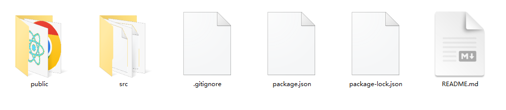
主要开发代码在src目录下。
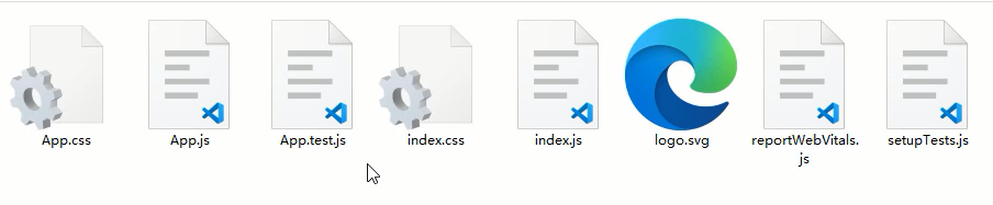
App.js为根组件,index.js为入口模块,index.css为全局样式文件。
插件的安装
首先需要在vsCode下安装,ES7+ React/Redux/React-Native snippets这个插件,他可以帮我们快速创建React组件的初始代码,也可以给JSX做一些提示操作。直接在vsCode的扩展中进行搜索即可安装。
可通过rcc快速创建一个类组件,可通过rfc快速创建一个函数组件。
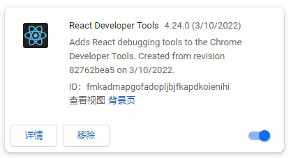
除了vsCode插件外,还需要安装一个Chrome插件,React Developer Tools 这个工具,可以对React组件进行查看,并且可观察到组件传递数据的情况。
课件中已经提供了相关工具,直接在Chrome下进行安装即可。
脚手架下需要注意的点
- 注意点:<></>
- 注意点:import React from ‘react’
- 注意点:<React.StrictMode>
- 注意点:脚手架下的注释
- 注意点:package.json中的eslint
<></>是<React.Fragment>的简写,在脚手架下可以采用这种简写方式,提供一个唯一根节点非常的有用。
import React from ‘react’ 这句话在React17之前是不能省略的,但是在React17版本之后是可以省略的,因为React17版本之后对JSX语法的解析有了新的转换方式,具体可参考:https://zh-hans.reactjs.org/blog/2020/09/22/introducing-the-new-jsx-transform.html
<React.StrictMode>为严格模式,可以检测到一些比较过时的语法,还有一些在操作React的时候的一些不规范写法等。
在脚手架下添加注释,可通过快捷键进行操作,通过alt + shift + a键来完成,非常的方便。
package.json中默认对eslint进行了支持,可找到eslintConfig属性进行一些eslint的设置,例如:rules字段。
脚手架下样式处理方式及Sass支持
在脚手架下对样式的处理方式非常的多,主要有:全局样式,Sass/Less支持,模块化CSS,CSS-in-JS,样式模块classnames等,下面就分别来看一下。
全局样式
在对应的jsx文件下创建的.css文件就是一个全局样式,在jsx引入后就可以在全局环境下生效。
1 | import './Welcome.css' |
这样操作很容易产生冲突,所以可以采用命名空间的方式来避免冲突,即最外层元素添加跟当前组件一样名字的选择器。
内部的其他选择器都是这个最外层选择器的后代选择器。
1 | // Welcome.css |
不过这样写样式会很麻烦,可利用预编译CSS的嵌套写法来对代码进行改进,这里以Sass作为演示。
预编译CSS的支持
首先默认脚手架是不支持Sass或其他预编译CSS的,所以需要安装第三方模块来进行生效。
1 | npm install sass |
安装好后,就可以编写已.scss为后缀的文件了。
1 | .Welcome{ |
模块化CSS
模块化的CSS,主要就是实现局部样式的能力,这样就只能在当前组件内生效,不会影响到其他的组件。模块化的CSS有格式上的要求,即[name].module.css
下面以Welcome组件举例:
1 | import style from './Welcome.module.css' |
这种局部的操作,style.box只会给指定的元素添加样式。
CSS-in-JS
这种方法主要会把CSS代码直接写入到JSX文件内,这样可以不分成两个文件,而是只需要一个文件就可以完成一个独立的组件开发。
这种CSS-in-JS的实现是需要借助于第三方模块的,目前比较流行的是:styled-components这个模块。首先是需要下载。
1 | npm install styled-components |
1 | import styled from 'styled-components' |
样式模块classnames
有时候操作class样式的时候,往往普通的字符串很难满足我们的需求,所以可以借助第三方模块classnames,他允许我们操作多样式的时候可以以对象的形式进行控制。
1 | import './Welcome.css' |
Ant Design框架的安装与使用(一)
什么是Ant Design框架
Ant Design是React的第三方UI组件库,类似于前面我们学习的Vue中的Element Plus。Ant Design是阿里巴巴旗下蚂蚁金服推出的开源框架,分为PC端与移动端。
下面演示PC端的使用方式,需要先下载安装,本小节安装的是”antd”: “^4.24.0”这个版本,如果后续升级了,大家可以通过@方式安装当前小节中指定的版本。
1 | npm install antd@4.24.0 |
除了在主入口文件中引入antd框架外,还需要引入他提供的antd全局样式文件。
1 | // index.css |
在antd中如果要使用图标的话,需要单独下载并使用。
1 | npm install @ant-design/icons |
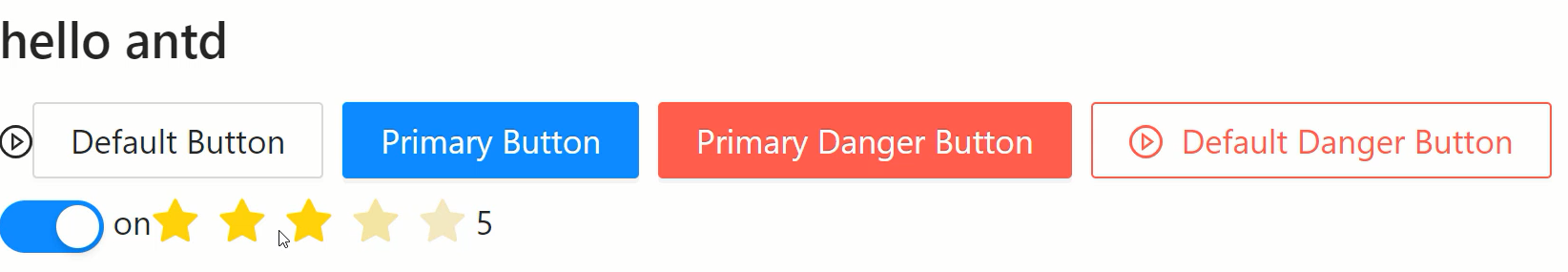
antd中基本组件的使用方式如下,例如:Button按钮组件,Space间距组件,Switch开关组件,Rate评分组件等:
1 | import { Button, Space, Switch, Rate } from 'antd' |
Ant Design框架的安装与使用(二)
本小节我们继续来看一下,antd中的一些复杂组件的使用。
主要就是表单组件涉及的操作是比较多的,下面就一起来看一下。
1 | import { Button, Checkbox, Form, Input } from 'antd'; |
这里可以先把表单组件的结构编写完成,主要使用到
